what ways do your media products use, develop or challenge the forms and conventions of real media products?
Throughout my planning and research for this coursework I looked into teaser trailers, posters and magazine covers for different genres. Then as a group we decided upon creating these products for a Horror film. We found this genre would be quicker and easier to produce with our limited equipment and travel for different locations. In addition without funding. By choosing this genre we could be imaginitive and create effective products.
The title of our film, Psychopath, is stereotypical of a film of the Horror genre and would stand out to the intended audience. We decided upon this name as it fits in with our plot; ROSIE's ex-lover turns insane and ends up locked up in prison after a sexual offence towasrd ROSIE.
While planning and filming ourteaser trailer we used dark, sihouetted, film noir lighting; this gives a sense of gloom and a sinister effect making the audience want to see what happens next. In the clips of ALI tieing ROSIE to the chair,we used flashing colours of red and green as these colours symbolise the un-easy, anxious feeling ROSIE is experiencing. The trailer opens to ROSIE walking down a hallway to her 'audition', We chose this location as we could organise for blue neon lights to be turned on; this is to show the viewers the creepy atmosphere and that where she is going may not be what she expects; she may be entering danger. In the last clips we used night-vision which turns everything bright, negavitve and creates a green tinge; this gives the sense of confusion showing the point of view shot from ROSIE. In addition, Rosie is wearing a red top, to represent the danger she is under. and Asif is wearing a black top to add to the sinister atmospere. These lighting ideas show the audience these feelings, emotions and warnings to fit in with the genre of the film.
While planning this teaster trailer, we decided to base it on the way in which cloverfields' was produced; showing the introcution to the film along with audio. However, our introduction was longer than the minute and half that the trailer needed to last. Therefore, we created a cliche teaser trailer; using different short clips of the film along to music. We used fade-ins and fade-outs while editing each clip to add to the 'dazed' and confused feeling ROSIE is feeling after being tied up and knocked un-concious by the 'film director', ALI. In the Alleyway shots we used manual focus on night-vision to show ROSIE's point of view shot; she is dazed and going in and out of conciousness. This gives a sense of mystery to the intended audience motivating them to watch the Horror film.
When choosing the music to fit our genre we looked into the music used in films such as Saw. After looking into Horror soundtracks, we came across the introduction song from Rihanna's new album; Rated R. This song creates suspense and tension, aswell as being 'catchy' and being sung by a famous artist. This would become recognised by the audience and the music would 'stick in their head'.
Overall, the mise-en-scene, sound, lighting, camera work and editing all works together well to create a teaser trailer fitting in with the codes and conventions for a film of the Horror genre.
To create our Film poster and magazine cover, we decided to use images that relate to the film's plot; by using photographs of ROSIE (Rosie) and CHRIS (Matt).
For the Movie magazine cover, I used an old photograph of myself and Matt and applied it to a black canvas on Photoshop. I applyed a smashed glass effect brush on top of this image give effect that the 'Psychopath', CHRIS, had smashed up an image of him and his ex-lover as she got him locked up in prison. This adds to the eery Horror genre shocking and confusing the viewer. By using the font colours Red and Green (aswell as the green of ROSIE's top) symbolises the anxiousness of what has happened and what happens in the film making the audience feel uncomfort. The structure and layout of the images and text on this anxillary product is cliche of a magazine cover advertising a horror film. I created the Title of the magazine in a large funky font that stands out, then added smaller text for extra information on the contents, date, price, website, barcode. I used a large image and thumbnail images to show the contents of the magazine and fill the page out. This would stand out to the audience and stimulate them to buy the magazine to find out about our film.
To create the Movie Poster, Matt created a shrine instalation by sticking images of CHRIS and ROSIE, old paper, tickets and an ash tray full of fag butts onto a board and photographed it. This is the full background of the poster. He then adjusted the contrast to add an eery effect and make abstract greens and yellows to stand out to the audience. Next, Polly added the text in white fonts to stand out to the audience and attract the intended Horror film lovers. She used cliche fonts for this genre to make it seem sinister and creepy.
Here are some screen grabs of our teaser trailer; this shows the different shots we used along with the lighting.
The sreen grab is the second shot of the teaser trailer; over the shoulder shot of Rosie walking down the hallway holding her audition sheet. This gives off the information she is entering an audition, shows her name and the director.

This shot shows the shot of ALI tieing ROSIE to the chair and 'bagging' her. The dark lighting and the colour red of Rosies top shows the danger of this scene.


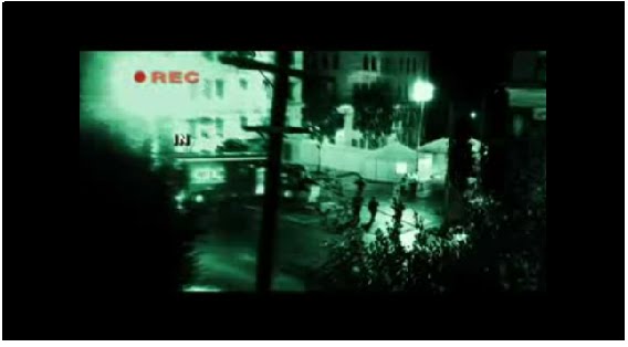
This is a screen grab from the night vision alleyway shots. The green tinge, bright light shows ROSIE is not completely consious and makes the audience feel uncomfortable and confused.

Quarantine trailer link. Director: John Eric Dowdle
How effective is the combination of your main product and anxillary texts?
I find our teaser trailer, movie poster and magazine cover fit well together. Although the anxillary texts and the teaser trailer use different characters, the show different parts of the film, Psychopath. The Teaser Trailer is showing the audition, including the characters ROSIE (Rosie) and ALI (Asif); this is clips of the introduction of the film. Whereas, the anxillary products show the plot of the film and images that show the character CHRIS (Matt) and ROSIE (Rosie) together and their photographs destroyed due to CHRIS becoming a Psychopath. These advertisments would confuse the intended audience motivating and stimulating them to find out more about the film and actually watch it.
How did you use new media technologies in the construction, research, planning and evaluation stages?
The main technology I have gained a skill in using in Blogger.com; by creating this coursework on an internet blog I have been able to show all of my research easier and quicker in one place with easy access. I have learnt how to embed videos off the internet, upload images onto this site and add links to Word documents.
In the planning of our teaser trailer and anxillary products I used my Canon 450D DSLR camera along with Adobe Photoshop to take the images for the loaction reccee, test shots and lighting tests. I also used Photoshop to edit the Movie magazine cover I created.
Screen grabs:
In the planning of our teaser trailer and anxillary products I used my Canon 450D DSLR camera along with Adobe Photoshop to take the images for the loaction reccee, test shots and lighting tests. I also used Photoshop to edit the Movie magazine cover I created.
Screen grabs:
Here is the film title, i used the 'line tool' to create a glass, sharp effect.

Here I opened and rotated an image of Matt and I, i then found a bruch tool, that i used in grey over the image to created a smashed frame effect

Here are a couple of things I included that are steriotypical of a magazine cover:
Date and price:

Barcode:
To create this I made a white box on a layer, I then used a barcode brush I downloaded and finally added numbers in a small basic font to make it realistic.

To create our teaser trailer we used FINAL CUT on an Apple Mac computer. As we had not used it before we had to find out all the skills our selves while editing the shots together.
No comments:
Post a Comment