After creating our main product: Teaser trailer, we uploaded it onto disc for others to view. Here are a couple of quotes people wrote about it.
"I really enjoyed it! it was fitting with the genre and quite disturbing! it defenetly set me up for wanting more! i loved the use of colour and i would see this film becasue it gave wet my apetite enough to want to see it, but didn't give too much away. I would give it a 8/10."
"loved it :) i really like the green (night vision) effect aswel as teh close up on the car.. the music fitted really well. only improvemnet would be to make sure all camera shots are steady- but apart from that it was really good. well done xx"
To add a wider range of feedback from our intended age group, horror loving audience; here are some video responses to our teaser trailer.
Here are the questions I have created that i will ask to the people I video after watching our teaser trailer:
Do you feel the lighting creates a sinister, disturbing atmosphere?
Does the soundtrack used fit the Horror genre?
Does the trailer motivate you to watch the film (if it was created into a full production)?
Are the camrea shots and editing used effective in creating a creepy mood?
After creating questionnaires, receiving written and video responses and graphs; overall, our feedbac was possitive.
Everyone found it disturbing with the use of mise en scene, sound, editing and camerawork we used in the creation. The majority of our intended audience were satisfied; however there was one main thing they would change; the title font at the end. I agree with this and if we could re-create our trailer this is something i would correct.
Here is my video reponse to our teaser trailer.
Saturday, 1 May 2010
Friday, 30 April 2010
Audience feedback- video responses
After creating our teaser trailer we uploaded in onto youtube.com for people to view. Here are some video responses Matt and I took in turns to film and read out the questions for. We asked people in the age group that our film is aimed at; its intended audience.
After talking to an audience and collecting written and video responsesdescided to make a graph of our findings. This shows possitive feedback off both the male and female gender.

Wednesday, 21 April 2010
Evaluation
what ways do your media products use, develop or challenge the forms and conventions of real media products?
Throughout my planning and research for this coursework I looked into teaser trailers, posters and magazine covers for different genres. Then as a group we decided upon creating these products for a Horror film. We found this genre would be quicker and easier to produce with our limited equipment and travel for different locations. In addition without funding. By choosing this genre we could be imaginitive and create effective products.
The title of our film, Psychopath, is stereotypical of a film of the Horror genre and would stand out to the intended audience. We decided upon this name as it fits in with our plot; ROSIE's ex-lover turns insane and ends up locked up in prison after a sexual offence towasrd ROSIE.
While planning and filming ourteaser trailer we used dark, sihouetted, film noir lighting; this gives a sense of gloom and a sinister effect making the audience want to see what happens next. In the clips of ALI tieing ROSIE to the chair,we used flashing colours of red and green as these colours symbolise the un-easy, anxious feeling ROSIE is experiencing. The trailer opens to ROSIE walking down a hallway to her 'audition', We chose this location as we could organise for blue neon lights to be turned on; this is to show the viewers the creepy atmosphere and that where she is going may not be what she expects; she may be entering danger. In the last clips we used night-vision which turns everything bright, negavitve and creates a green tinge; this gives the sense of confusion showing the point of view shot from ROSIE. In addition, Rosie is wearing a red top, to represent the danger she is under. and Asif is wearing a black top to add to the sinister atmospere. These lighting ideas show the audience these feelings, emotions and warnings to fit in with the genre of the film.
While planning this teaster trailer, we decided to base it on the way in which cloverfields' was produced; showing the introcution to the film along with audio. However, our introduction was longer than the minute and half that the trailer needed to last. Therefore, we created a cliche teaser trailer; using different short clips of the film along to music. We used fade-ins and fade-outs while editing each clip to add to the 'dazed' and confused feeling ROSIE is feeling after being tied up and knocked un-concious by the 'film director', ALI. In the Alleyway shots we used manual focus on night-vision to show ROSIE's point of view shot; she is dazed and going in and out of conciousness. This gives a sense of mystery to the intended audience motivating them to watch the Horror film.
When choosing the music to fit our genre we looked into the music used in films such as Saw. After looking into Horror soundtracks, we came across the introduction song from Rihanna's new album; Rated R. This song creates suspense and tension, aswell as being 'catchy' and being sung by a famous artist. This would become recognised by the audience and the music would 'stick in their head'.
Overall, the mise-en-scene, sound, lighting, camera work and editing all works together well to create a teaser trailer fitting in with the codes and conventions for a film of the Horror genre.
To create our Film poster and magazine cover, we decided to use images that relate to the film's plot; by using photographs of ROSIE (Rosie) and CHRIS (Matt).
For the Movie magazine cover, I used an old photograph of myself and Matt and applied it to a black canvas on Photoshop. I applyed a smashed glass effect brush on top of this image give effect that the 'Psychopath', CHRIS, had smashed up an image of him and his ex-lover as she got him locked up in prison. This adds to the eery Horror genre shocking and confusing the viewer. By using the font colours Red and Green (aswell as the green of ROSIE's top) symbolises the anxiousness of what has happened and what happens in the film making the audience feel uncomfort. The structure and layout of the images and text on this anxillary product is cliche of a magazine cover advertising a horror film. I created the Title of the magazine in a large funky font that stands out, then added smaller text for extra information on the contents, date, price, website, barcode. I used a large image and thumbnail images to show the contents of the magazine and fill the page out. This would stand out to the audience and stimulate them to buy the magazine to find out about our film.
To create the Movie Poster, Matt created a shrine instalation by sticking images of CHRIS and ROSIE, old paper, tickets and an ash tray full of fag butts onto a board and photographed it. This is the full background of the poster. He then adjusted the contrast to add an eery effect and make abstract greens and yellows to stand out to the audience. Next, Polly added the text in white fonts to stand out to the audience and attract the intended Horror film lovers. She used cliche fonts for this genre to make it seem sinister and creepy.
Here are some screen grabs of our teaser trailer; this shows the different shots we used along with the lighting.
The sreen grab is the second shot of the teaser trailer; over the shoulder shot of Rosie walking down the hallway holding her audition sheet. This gives off the information she is entering an audition, shows her name and the director.

This shot shows the shot of ALI tieing ROSIE to the chair and 'bagging' her. The dark lighting and the colour red of Rosies top shows the danger of this scene.


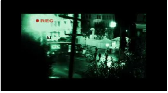
This is a screen grab from the night vision alleyway shots. The green tinge, bright light shows ROSIE is not completely consious and makes the audience feel uncomfortable and confused.

Quarantine trailer link. Director: John Eric Dowdle
How effective is the combination of your main product and anxillary texts?
I find our teaser trailer, movie poster and magazine cover fit well together. Although the anxillary texts and the teaser trailer use different characters, the show different parts of the film, Psychopath. The Teaser Trailer is showing the audition, including the characters ROSIE (Rosie) and ALI (Asif); this is clips of the introduction of the film. Whereas, the anxillary products show the plot of the film and images that show the character CHRIS (Matt) and ROSIE (Rosie) together and their photographs destroyed due to CHRIS becoming a Psychopath. These advertisments would confuse the intended audience motivating and stimulating them to find out more about the film and actually watch it.
How did you use new media technologies in the construction, research, planning and evaluation stages?
The main technology I have gained a skill in using in Blogger.com; by creating this coursework on an internet blog I have been able to show all of my research easier and quicker in one place with easy access. I have learnt how to embed videos off the internet, upload images onto this site and add links to Word documents.
In the planning of our teaser trailer and anxillary products I used my Canon 450D DSLR camera along with Adobe Photoshop to take the images for the loaction reccee, test shots and lighting tests. I also used Photoshop to edit the Movie magazine cover I created.
Screen grabs:
In the planning of our teaser trailer and anxillary products I used my Canon 450D DSLR camera along with Adobe Photoshop to take the images for the loaction reccee, test shots and lighting tests. I also used Photoshop to edit the Movie magazine cover I created.
Screen grabs:
Here is the film title, i used the 'line tool' to create a glass, sharp effect.

Here I opened and rotated an image of Matt and I, i then found a bruch tool, that i used in grey over the image to created a smashed frame effect

Here are a couple of things I included that are steriotypical of a magazine cover:
Date and price:

Barcode:
To create this I made a white box on a layer, I then used a barcode brush I downloaded and finally added numbers in a small basic font to make it realistic.

To create our teaser trailer we used FINAL CUT on an Apple Mac computer. As we had not used it before we had to find out all the skills our selves while editing the shots together.
Wednesday, 14 April 2010
Anxillary Products- Magazine Poster and Movie Cover
Magazine cover for Psychopath.
To create this movie poster i opened an A4 blank canvas on Photoshopto use as my backbground, as everything stands out on black. In addition black is a sinister colour that represents death. I then found an old photograph of Matt (Chris)and I (Rosie), rotated it 15 degrees counter-clockwise and applied a downloaded brush from www.Deviantart.com; which gives the impression of a smashed photo frame. I used the font: 'Amprior', for the Magazine title as it fits its name; EPIC. For the film title I used white lines to look like broken glass and look sharp to stand out and fit the Horror genre. To create an uneasy effect, which symbolises uncomfort and mystery I have used the font colours: Green and Red. I have added captions such as; Barcodes, prices, date, '2 free posters inside!' and exclusive interviews on this magazine cover to create a realistic product.

Here is the finished product: MOVIE MAGAZINE COVER.
To make this cover better I filled the empty space with, 'behind the scenes' images and extra photos of 'Rosie and Chris'. I find the fonts, images and colours fit our genre and would attract our intended audience. 16-24 year old, I believe, would buy this magazine.

Here is the image Matt created by placing the objects in the photograph on a shelf. He then photographed the installation and adjusted the contrast to make it seem eery. I like the way in which the images look burnt and the muted colours create a neon effect, making it stand out to viewer. It fits with the horror genre by the inclusion of the ash tray; this would attract our intended audience as they can relate; i think the candle creates a focal point around the images. It creates a shrine like construction.

Here is a test creation of the movie poster. I like how she has added the actors names and used a notice board with sticky nots. However i do not feel it fits the horror genre or would attract our intended audience. For our poster we would need to take typography into consideration to create a sinister effect.

Here is the finished film poster. Following on from the installation Matt created; Polly added text to created it into a film poster. She used a cliche Horror font for the film title; Psychopath. In addition she added my name (Rosie Thomson) to the top of the page, this is steriotypical of a film poster as the main actor/actresses name is mentioned at the top. In addition she has added extra information at the bottom aswell as a caption of a tag line for the film.

Wednesday, 3 March 2010
Sketches and Photographs for Poster and Magazine Cover
For our poster and magazine cover we will use (my) Rosie's DSLR to shoot the photographs. By using images of Rosie and Matt (Chris) in a 'ripped-up Polaroid' effect; this will show the idea of the characters Chris and Rosie being in love and happy together before the incident that causes Rosie to get him locked up in jail. The images being 'ripped-up' shows the anger that Chris feels for Rosie as he loves her but hates that she got him put into jail. This leads into the story line of Chris hiring the Hitman (Asif) to catch her at an audition and seek revenge.
This set of test shots are posed by Rosie and Matt who are the characters ROSIE and CHRIS. The mood intended is happy, lovable and the late couple are seen to be enjoying themselves. Matt's character is seen to be quite 'matcho' and 'chavvy' to show irony on the force he uses on Rosie in the plot for our teaser trailer.


Here is the sketch idea for our Movie magazine cover. The aimed effect is ripped up polaroids on a cork board with 'psychopath' scratched into the image.

In order to create our Poster and magazine cover; we will use Photoshop. By using an A4 blank canvas for each anxillary product on Photoshop, to create the products onto; they will print clear at this size without any stretching of the image having to occur. We will make sure the DSLR camera is set on RAW format on a large scale; therefore when adjusting the image size to fit on the canvas and editing the images, the images will not pixalate and will be sharp and clear.
Here is our latest idea for our Movie Poster. We have decided to name it Epic as this seems quirky and makes a statement. The bold orange title will be on a dark background to make it stand out. The idea behind the design for the movie is again about CHRIS and ROSIE; showing the plot idea of the film. The image of the characters is in a smashed frame showing their relationship as 'broken and smashed up'. We will spell out the film name 'Psycopath' with the glass of the frame. In addition, we will add a barcode and extra information about the magazine contents for realism.

Here is a sketch idea for the film poster. Here we will include the ripped up polaroids of the late couple along with the title of the film, the actors', director's and cameramen's names.

Font Tests for anxillary products
FONT TESTING
From using font software, Polly has tested out different fonts with our chosen film name to see which ones look best, and which one we may want to use for our films poster.

This one looks as though it is dripping bloody, which woud be very good if our film was very gory. However as it is not this may not be best suited. The font of the writing is effective though, so we may keep it.

This font looks quite mysterious however I think it looks like a font from an old film, where as our film is modern so we need a more modern font. I like how the font is quite jagged and creepy however if it was to fit in with the thriller genre as well it may not look as professional.

This font that Polly chose is similar to some of the fonts from real film posters, as it is very bold and all the letters are in capitals. This makes it stand out and will capture the viewers attention. If the title is powerful and bold it may also effect the film and improve the image.
Polly quotes this as one of her favourite fonts, because it has a very intriguing effect however it doesn't particularly represent a certain genre, therefore it would be perfect for our film. It does look quite spooky but it's not too over the top like the first font Polly chose. We would also have to think about how we could incorporate it into the poster and what colour font we would use as it probably wouldn't look as professional if it was a different colour.

This font is very simple and basic, which was why she chose it as an idea. It is very clear for the reader to see and as it is all in capitals it does stand out. The only problem is that this type of font is sometimes associated with alien movies as it looks very sci-fi.
The following two fonts are quite similar as they are both under the 'handwritten' section. Both would be good for our film, however the bottom one does look slightly more suitable for a horror title. Although they are not in capital letters they do stand out for being slightly different to other horror/thriller films.

Lighting tests for Audition: second setting
These images of the lighting in the TV studio were taken by Lou and Rosie on Rosie's DSLR.


Here is a shot of Rosie tied to the chair during her audition.


Lighting Effects Used in Our Trailer
While we were filming, the lighting effects had to be as intended; so that they fit the horror genre to attract the target audience and create an atmosphere that is thrilling and tension building.
In order to create an eery, mysterious effect we arranged for the neon light to be turned on and the main tungten lighting to be switched off for the Hallway shots; as the female character walks to her audition. This sets the mood and genre at the start of the trailer; catching the attention of the horrror loving audience, puzzling them and showing a spooky atmosphere.
For the audition room shots we tested the lights and came up with an order of lighting throughout. Firstly, we used one red light and the main singer light; this gave the room a slight red tint but it wasn't too overpowering as Rosie needed to be visible, this shows the audience she is the main character and the red symbolises the danger she is in. The lighting stayed the same until Rosie had collected her chair as told and took it to the centre of the room - at this point the Singer light was brighter which showing the audience Rosie is uncomfortable as the light was shining in her eyes therefore she couldn't see anyone or anything around her.
As Ali (Asif) hits Rosie round the head with the hammer, the lighting colour change along with the brightness levels so a flashing effect is created; this shows a sense of panic to the audience, bulding the tension. Just before the hammer hits Rosie we created a blackout by switching all the lights off for a sudden change of atmosphere. This enables the audiences to reflect on what had happened and for the scene to calm down.
While shooting the alleyway scene a combination of Nightvision shots and natural shots were used, this was in the late afternoon on a dull day in a dark alleyway; therefore the lighting was limited creating a murky atmosphere. This shows the audience that the hand held camera, blurry footage is a point of view from Rosie; taking them to the edge to find out what happens next, creating a 'nerve racking' atmosphere.
For the car shots we used the lighting from the street lights ( as it was night time) along with the front and rear lights of the car. To create a natural look, the red tinge created again gives the audience a sence of danger as to what has happened to the main character, drawing their tension in and making them want to see the film, Psychopath.
Teaser trailer music!
The music for our film need to fit the horror genre and attract the audience; along with fitting in with our story line and footage.
Suspence and intense excitement needs to be created with our music; dark tones that change from slow to fast pace building tension and setting the mood and atmosphere.
The first song we have thought about is called 'Madhouse' by Rihanna, as it is an intro to her music album therefore it is only 1 minute, 35 seconds long. It has the perfect tempo and it isn't too over the top and loud but it is intriguing and catchy. It is likely that we will use this song as it fits perfectly with our trailer andis 'catchy' which is important while attracting the audiences attention.
Another soundtract used for Saw would fit our trailer; it creates tension without lyrics. It is intriguing and catchy to the audience with its perfect tempo and tension build.
Rihanna- Mad House
Saw Sound track
Here is a website which has several suspense and thriller sound tracks which is perfect for giving us ideas of what sort of music we could try throughout different parts to create excitement, as there are many different sounds that all fit into the thriller genre.
Below is a list of music that we could use throughout our film, however these are only ideas and we may come up with different music when editing:
Alexandre Desplat – New Moon
Minerva - Deftones
My Chemical Romance - I Dont Love You
Nany Sinatra - Bang Bang (My Baby Shot Me Down)
Evanescence - Bring Me To Life
My Chemical Romance - Famous Last Words
Finally we have decided Rihanna- Mad house fits our genre and footage the best. We feel the tempo build up created an eery atmosphere which adds tension and excitement to the intended audience drawing in their attention. It is the perfect timing for a teaser trailer.


Tuesday, 2 March 2010
Story Board

Shot Lists
Our Teaser trailer will mainly consist of long shotsas to define the style we are trying to achieve, (an audition tape). At the beginning we will use an OVER THE SHOULDER shot, whilst using HAND HELD CAMER to create a realistic effect, as the frame is tilted.

Here we will use LONG SHOTS to make the shots clear.

These are CLOSE UPS and EXTREME CLOSE UPS will create an essence of disorientation.

Monday, 1 March 2010
Costume sketches
Here is the costume sketch for ROSIE.She will wear red to symbolise danger and look smart but casual for her audition.

This is the costume stech for ALI. He will also look smart/ casual. He will wear a black top or shirt to look important, however, jeans to look casual.

Tuesday, 16 February 2010
Location recee
Accessability, Feasability, Health and Safety.
Our possible locations were difficult to assess in terms of their accessability and whether or not our group would be free to travel on specific days outside lesson times. We have decided the college TV studio is highly equiped with what we need for the majority of our filming and easily accessible for our group.
Our other locations include the Hallway used by the drama students for performances in our college. This is easily accessible and has effective lighting that will be highly beneficial to our production.
We will also take the camera off campus, to a Carpark down an alley at around dusk. We have decided to use one in Evesham. Evesham is a secure location as it is near to Rosie's house in case of any emergencies as well as the local hospital. Our other location is the car interior. Here is the car we will be using, we have organised a day in which we can use this for filming.

Here is a photograph of Hitman- ALI (Asif) and his car- ROSIE will be kidnapped in.

This is the corridoor in which we intend to shoot the first scene of our teaser trailer. Here, ROSIE will be waiting to be called into her 'Audition'. We feel the blue neon lights in the dark hallways adds an eery atmosphere to set the scene.

Here is the alleyway in which scene three will be shot. It is loacted in Worcester. This grimey, graffitied, urban setting is perfect for the mood and atmosphere of our horror film; it adds mystery and gloom.


This is a map, highlighting the potential route if a severe emergency would occur that would disclose college facilities.

This is a map highlighting where the local hospital is in Evesham in relation to our desired location.

This is another map, showing where (my) Rosie's house is in relation to our filming location, which assures for any minor emergencies.

As we will be using an actor who does not attend our college, it has been difficult to arrange photography shoots and to organise our shooting schedule. However, we have a day in which all can attend with ease. We must remember to sign Asif in as a visitor, in case of fire. We will use our cars for travel expenses and any emergencies that may occur off campus.
Subscribe to:
Comments (Atom)